介紹如何在 R 中使用 ggplot2 套件繪製各種樣式的箱型圖(box plot)。
安裝並載入 ggplot2 套件:
# 安裝 ggplot2 套件
install.packages("ggplot2")

# 載入 ggplot2 套件
library(ggplot2)
這裡我們以 ToothGrowth 資料集為範例,此資料集包含三欄變數:
# 顯示 ToothGrowth 的資料結構
str(ToothGrowth)
'data.frame':   60 obs. of  3 variables:
 $ len : num  4.2 11.5 7.3 5.8 6.4 10 11.2 11.2 5.2 7 ...
 $ supp: Factor w/ 2 levels "OJ","VC": 2 2 2 2 2 2 2 2 2 2 ...
 $ dose: num  0.5 0.5 0.5 0.5 0.5 0.5 0.5 0.5 0.5 0.5 ...
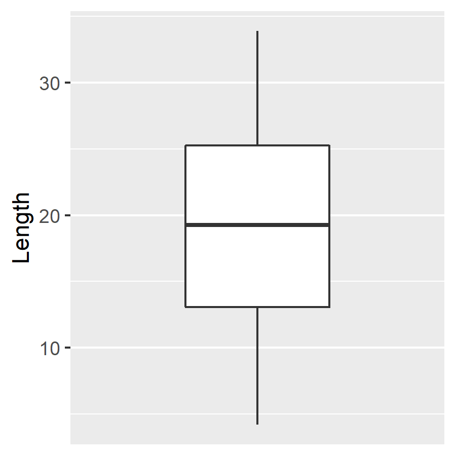
如果要使用 ggplot 繪製單一變數的箱形圖,可加上 scale_x_discrete 將 X 軸標示移除。例如將 ToothGrowth 資料集中的 len 資料分布繪製成箱形圖:
# 單一變數箱形圖
ggplot(ToothGrowth, aes(y = len)) +
  geom_boxplot() +     # 箱形圖
  scale_x_discrete() + # 移除 X 軸標示
  ylab("Length")       # Y 軸標示文字
若要將目前以 ggplot2 所繪製的圖形儲存起來,可以使用 ggsave 函數:
# 儲存 ggplot2 目前繪製的圖形
ggsave("output.png", width = 3, height = 3)
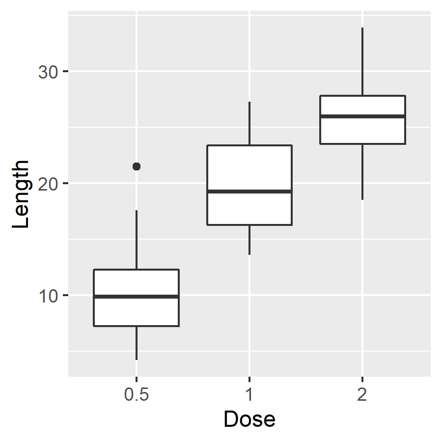
依據 dose 的數值分組,繪製基本的箱形圖:
# 繪製基本箱形圖
ggplot(ToothGrowth, aes(x = as.factor(dose), y = len)) +
  geom_boxplot() + # 箱形圖
  xlab("Dose") +   # X 軸標示文字
  ylab("Length")   # Y 軸標示文字
這裡的 dose 實際上是數值資料,若要當成類別型的資料來作為分組的依據,就要先以 as.factor 將其轉為因子(factor)變數,這樣 ggplot 才會畫出正確的圖。
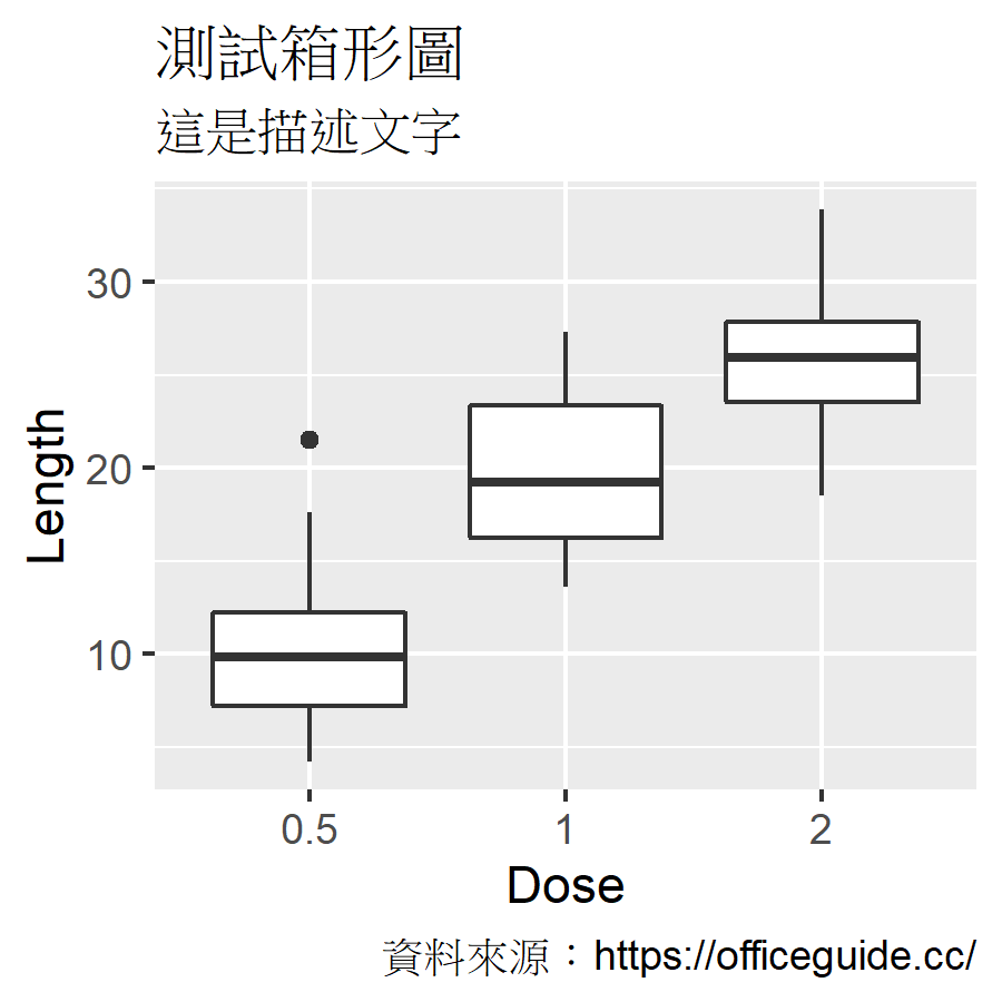
透過 labs 可以加入標題、副標題等說明文字:
# 加入標題、描述等文字
ggplot(ToothGrowth, aes(x = as.factor(dose), y = len)) +
  geom_boxplot() +
  xlab("Dose") +
  ylab("Length") +
  labs(title = "測試箱形圖", subtitle = "這是描述文字") +
  labs(caption = "資料來源:https://officeguide.cc/")
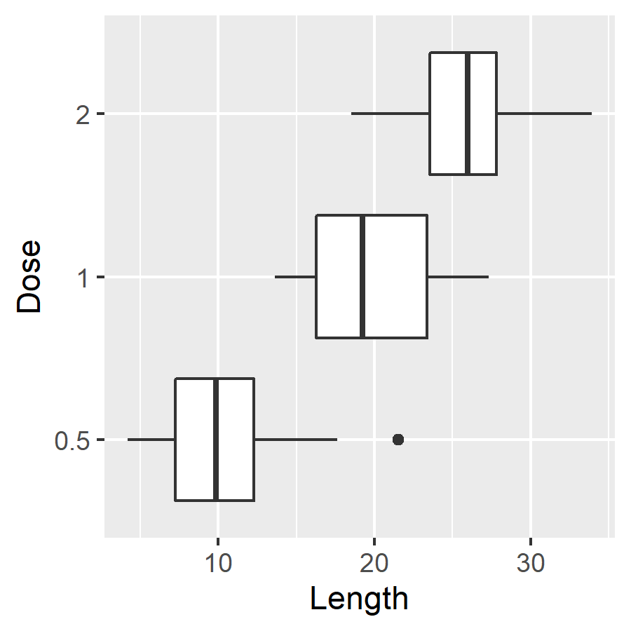
加入 coord_flip 可以讓 ggplot 圖形的 X 軸與 Y 軸互換:
# X 軸與 Y 軸互換
ggplot(ToothGrowth, aes(x = as.factor(dose), y = len)) +
  geom_boxplot() +
  xlab("Dose") +
  ylab("Length") +
  coord_flip()     # X 軸與 Y 軸互換
在 geom_boxplot 中加入 notch 參數,可以繪製缺口箱形圖,缺口範圍代表中位數的 95% 信賴區間:
# 繪製缺口箱形圖
ggplot(ToothGrowth, aes(x = as.factor(dose), y = len)) +
  geom_boxplot(notch = TRUE) + # 缺口箱形圖
  xlab("Dose") +
  ylab("Length")
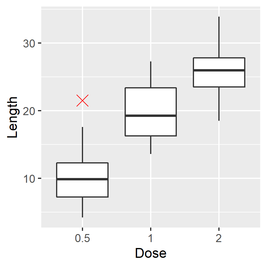
離群值(outlier)標示點的顏色、大小與樣式都可以自訂:
# 自訂離群值標示
ggplot(ToothGrowth, aes(x = as.factor(dose), y = len)) +
  geom_boxplot(outlier.colour = "red", # 離群值標示顏色
               outlier.shape = 4,      # 離群值標示樣式
               outlier.size = 4) +     # 離群值標示大小
  xlab("Dose") +
  ylab("Length")
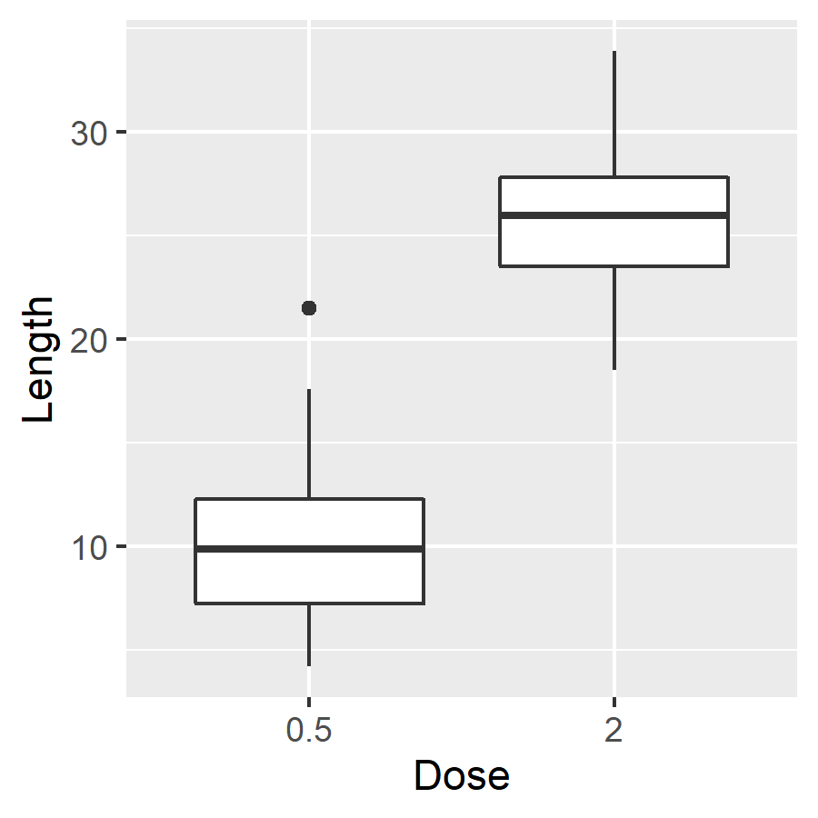
透過 scale_x_discrete 可以指定要繪製箱形圖的組別,將不重要的組別隱藏起來:
# 僅顯示指定組別
ggplot(ToothGrowth, aes(x = as.factor(dose), y = len)) +
  geom_boxplot() +
  xlab("Dose") +
  ylab("Length") +
  scale_x_discrete(limits = c("0.5", "2")) # 僅顯示 0.5 與 2
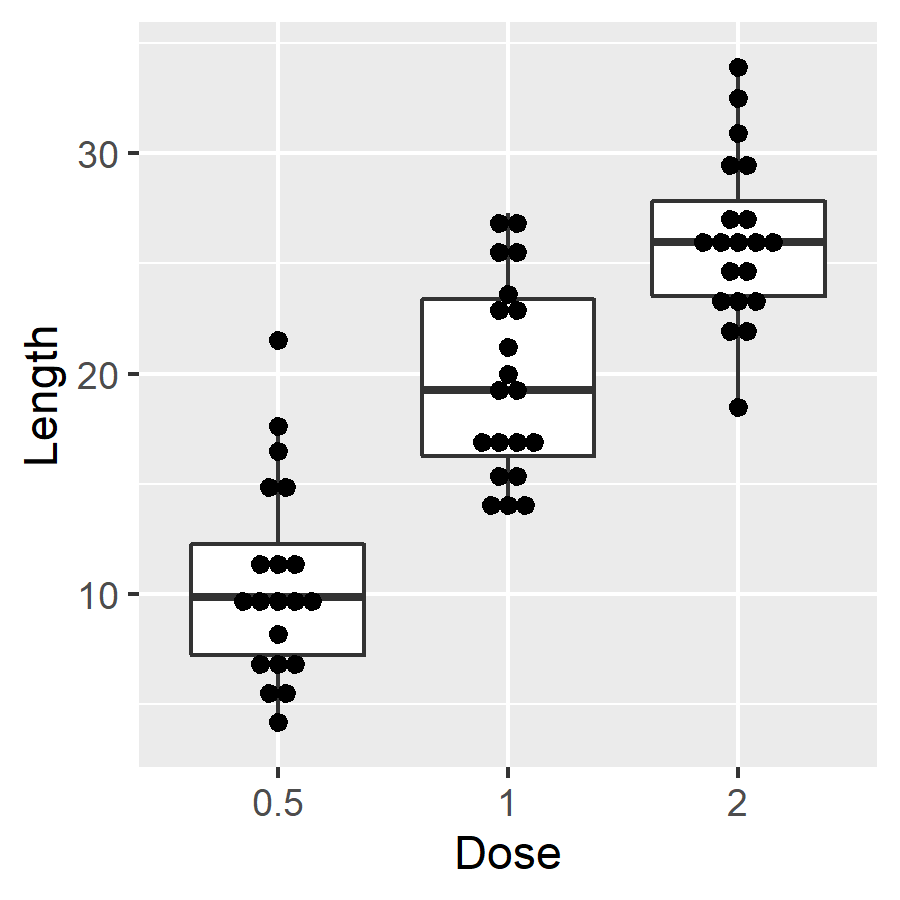
geom_dotplot 可以將實際的資料位置以點的方式標示在箱形圖中:
# 加入資料點
ggplot(ToothGrowth, aes(x = as.factor(dose), y = len)) +
  geom_boxplot() +
  xlab("Dose") +
  ylab("Length") +
  geom_dotplot(binaxis = 'y',       # 加入資料點
               stackdir = 'center', # 置中對齊
               dotsize = 0.8)       # 資料點大小
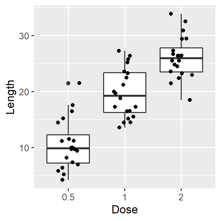
geom_jitter 可以加入錯開位置的資料點,避免資料點重疊問題:
# 加入錯開位置的資料點
ggplot(ToothGrowth, aes(x = as.factor(dose), y = len)) +
  geom_boxplot() +
  xlab("Dose") +
  ylab("Length") +
  geom_jitter(shape = 16,                      # 資料點樣式
              position = position_jitter(0.2)) # 資料點位置
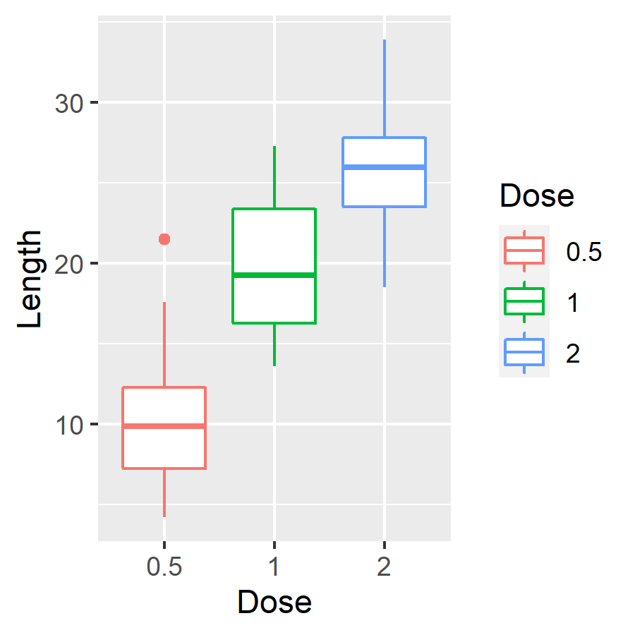
若要將不同組別的資料以不同顏色表示,可以使用 color 參數指定上色的依據:
# 依據 dose 上色
ggplot(ToothGrowth, aes(x = as.factor(dose), y = len, color = as.factor(dose))) +
  geom_boxplot() +
  xlab("Dose") +
  ylab("Length") +
  labs(color = "Dose") # 圖示區標題
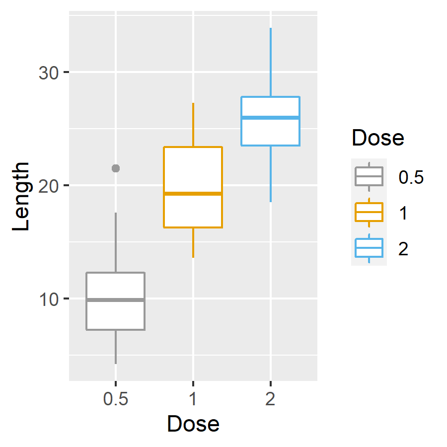
亦可使用 scale_color_manual 以色碼自行指定色彩:
# 以預設色彩繪圖
p <- ggplot(ToothGrowth, aes(x = as.factor(dose), y = len, color = as.factor(dose))) +
  geom_boxplot() +
  xlab("Dose") +
  ylab("Length") +
  labs(color = "Dose")

# 自訂色彩
p + scale_color_manual(values = c("#999999", "#E69F00", "#56B4E9"))
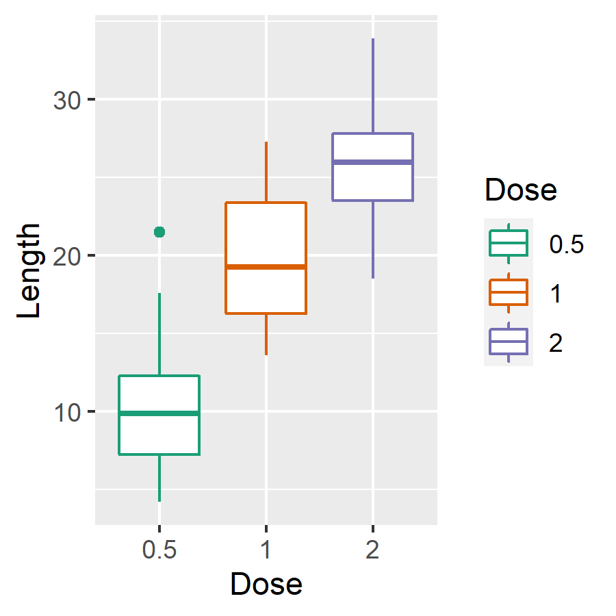
採用內建的 brewer 色盤來挑選顏色:
# 採用 brewer 色盤
p + scale_color_brewer(palette = "Dark2")
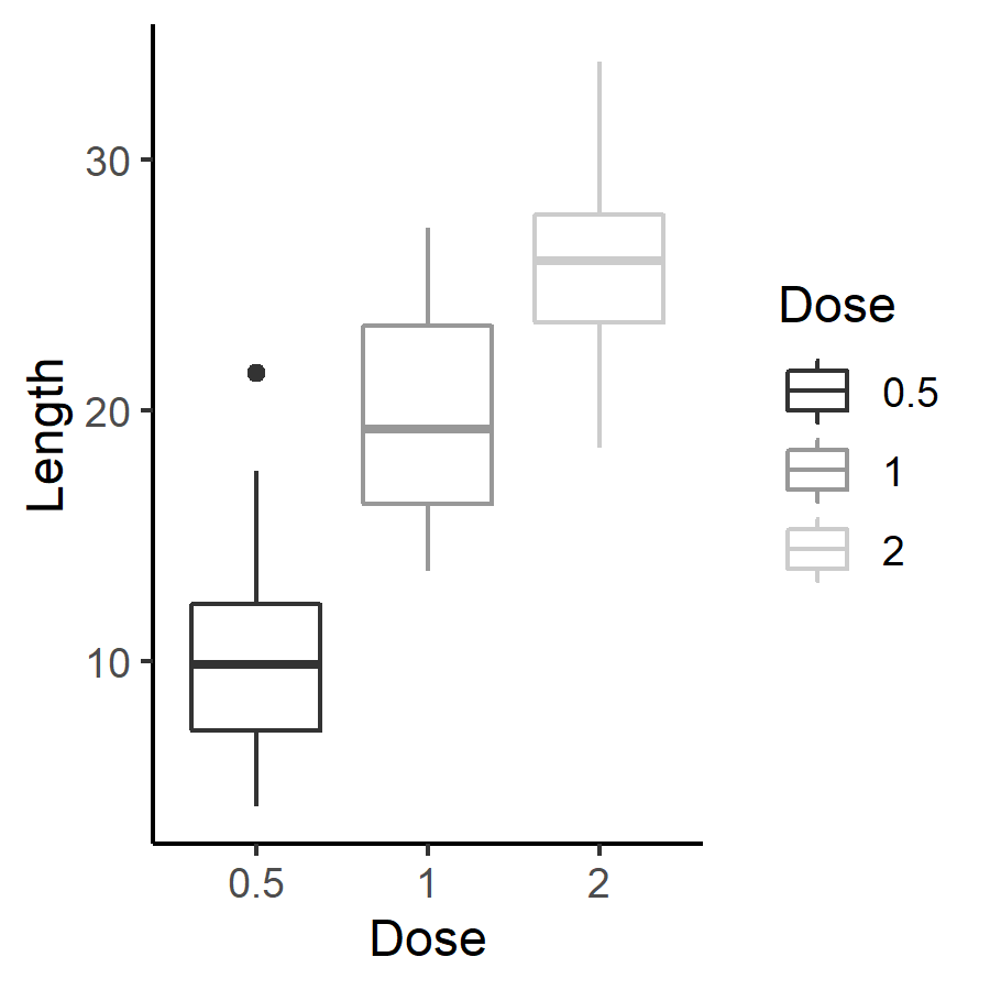
使用灰階配色:
# 灰階配色
p + scale_color_grey() + theme_classic()
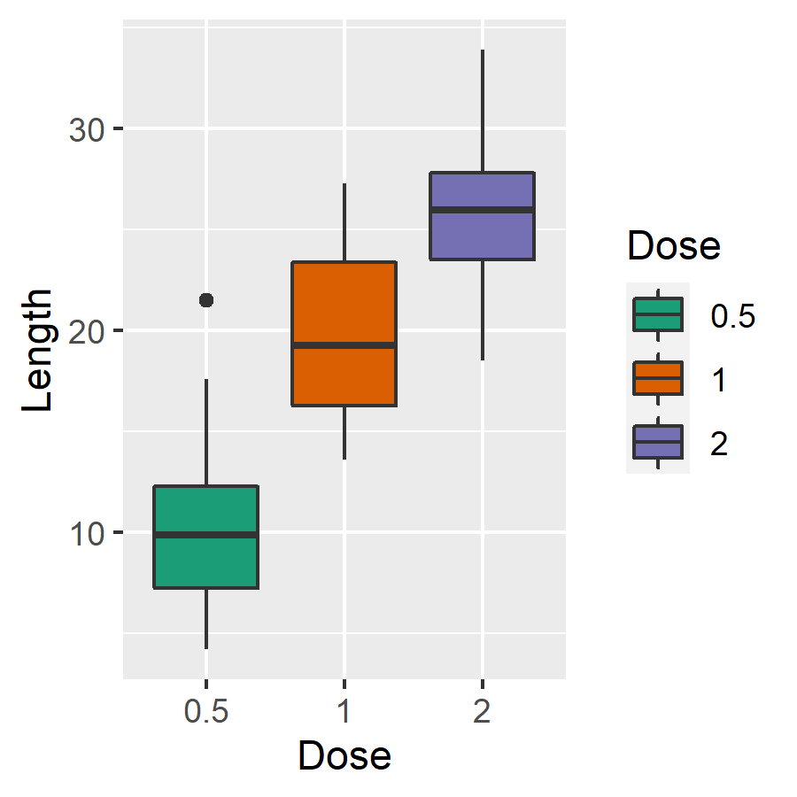
若要依據組別設定填滿顏色,可以使用 fill 參數指定上色的依據:
# 依據 dose 填滿顏色
ggplot(ToothGrowth, aes(x = as.factor(dose), y = len, fill = as.factor(dose))) +
  geom_boxplot() +
  xlab("Dose") +
  ylab("Length") +
  labs(fill = "Dose") # 圖示區標題
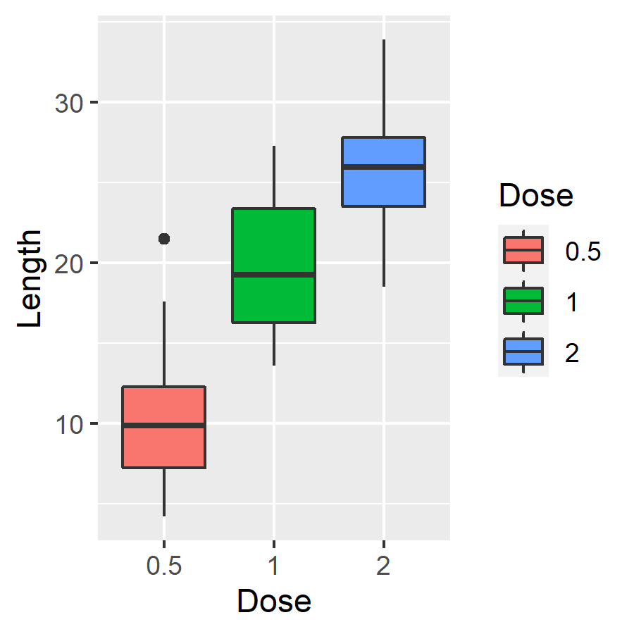
亦可使用 scale_fill_manual 以色碼自行指定填滿的色彩:
# 以預設色彩繪圖
p <- ggplot(ToothGrowth, aes(x = as.factor(dose), y = len, fill = as.factor(dose))) +
  geom_boxplot() +
  xlab("Dose") +
  ylab("Length") +
  labs(fill = "Dose")

# 自訂色彩
p + scale_fill_manual(values = c("#999999", "#E69F00", "#56B4E9"))
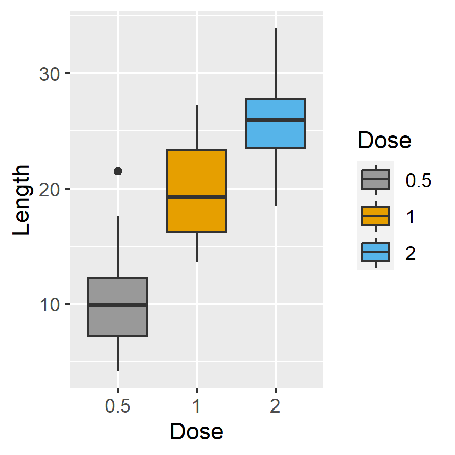
採用內建的 brewer 色盤來挑選填滿顏色:
# 採用 brewer 色盤
p + scale_fill_brewer(palette = "Dark2")
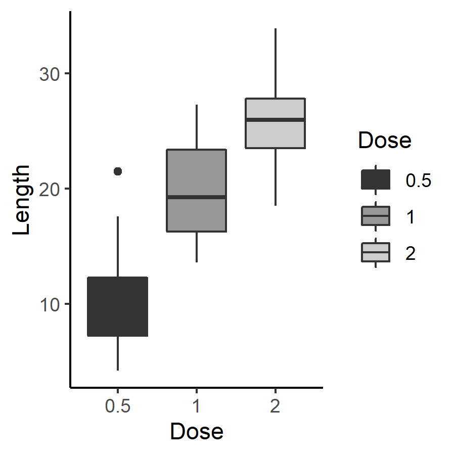
使用灰階配色:
# 灰階配色
p + scale_fill_grey() + theme_classic()
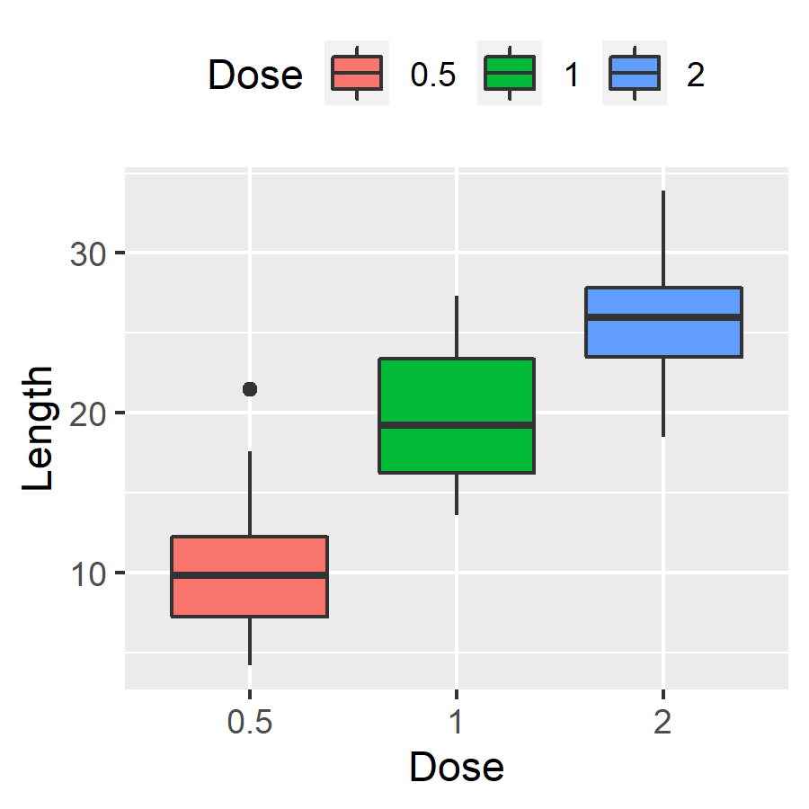
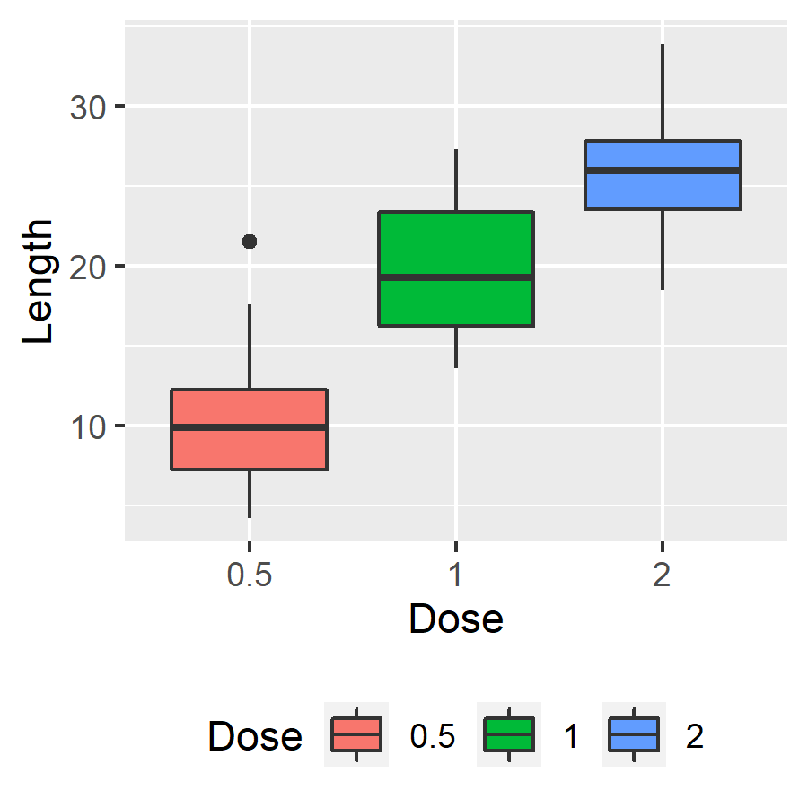
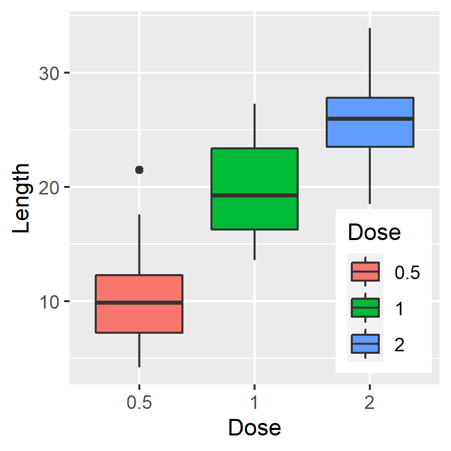
使用 theme 的 legend.position 參數可以更改圖示說明位置,例如將圖示放在上方:
# 更改圖示說明位置(上方)
p + theme(legend.position = "top")
# 更改圖示說明位置(下方)
p + theme(legend.position = "bottom")
# 更改圖示說明位置(自訂位置)
p + theme(legend.position = c(0.85, 0.25))
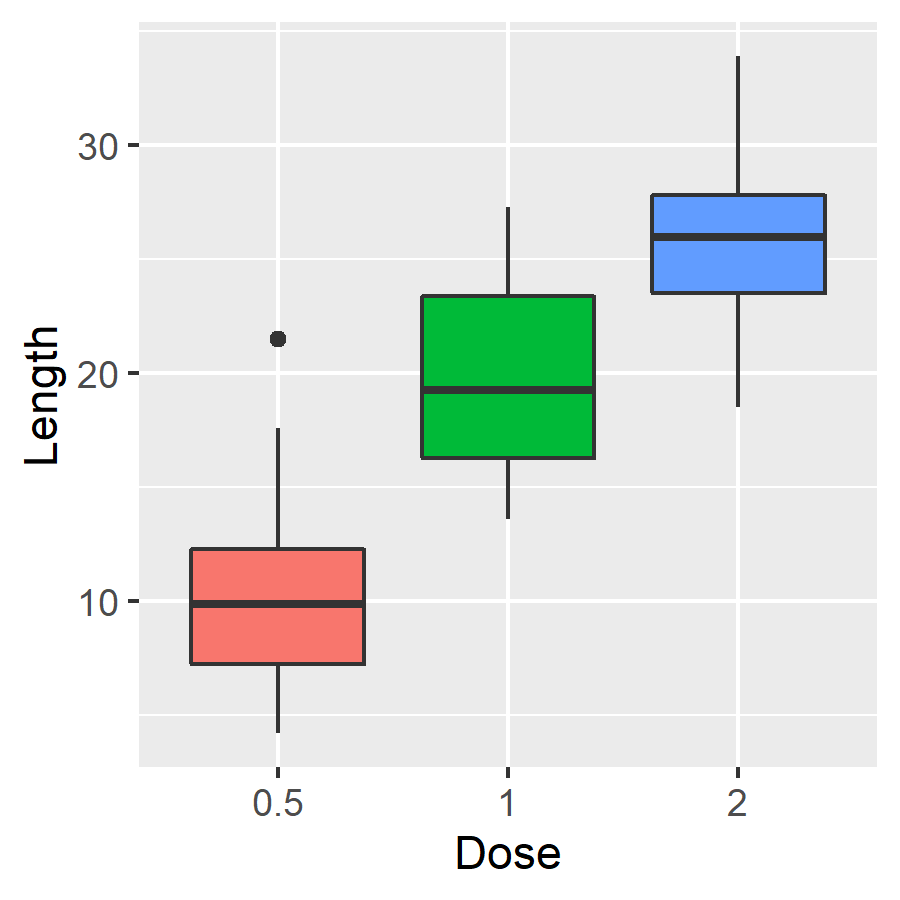
若將 theme 的 legend.position 參數設定為 none 則可移除圖示說明:
# 移除圖示說明
p + theme(legend.position = "none")
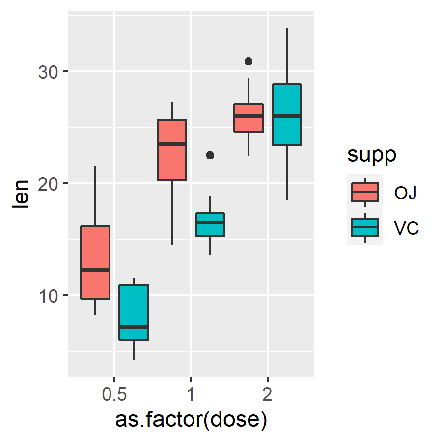
若需要依據第二種類別進行二次分組,可以將 fill 指定為第二種類別:
# 依據 supp 二次分組
ggplot(ToothGrowth, aes(x = as.factor(dose), y = len, fill = supp)) +
  geom_boxplot(position = position_dodge(1))