介紹如何使用 ggrepel 套件自動排版 ggplot2 圖形中的文字標示,避免文字互相重疊。
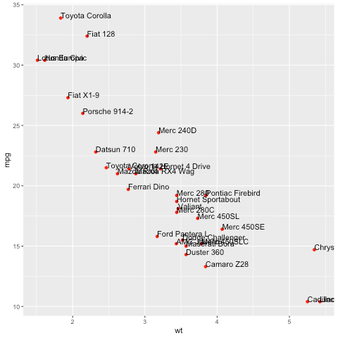
ggplot2 是目前主流的 R 繪圖套件,在繪製 XY 散佈圖的時候,若要在圖形中的座標點上標示文字,可以使用 geom_text 這一種圖層功能,並配合 hjust 與 vjust 參數來微調文字的位置,不過當資料點非常密集的時候,就很容易產生文字重的狀況。
library(ggplot2)
# 一般 ggplot2 圖形
ggplot(mtcars, aes(wt, mpg, label = rownames(mtcars))) +
  geom_point(color = 'red') +
  geom_text(hjust = 0, vjust = 0)
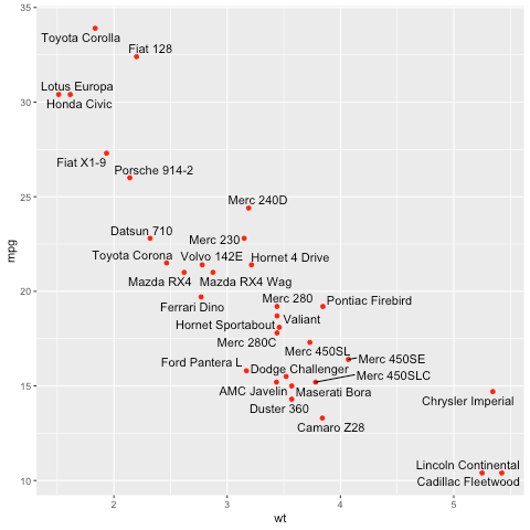
ggrepel 是一個專門用來解決文字標示重疊問題的套件,它會自動在圖形中尋找適當的空間來放入標示文字,讓整張圖形變得非常精緻且容易閱讀,解決了資料點過於密集造成的文字重疊問題。
若要使用 ggrepel 套件,可從官方的 CRAN 套件庫安裝,並且載入之:
# 安裝 ggrepel 套件
install.packages("ggrepel")

# 載入 ggrepel 套件
library(ggrepel)
ggrepel 所提供的 geom_text_repel 圖層功能跟傳統的 geom_text 類似,不過它會自動將文字放在適當的位置上,避免重疊:
# 以 ggrepel 標示文字
ggplot(mtcars, aes(wt, mpg, label = rownames(mtcars))) +
  geom_point(color = 'red') +
  geom_text_repel()
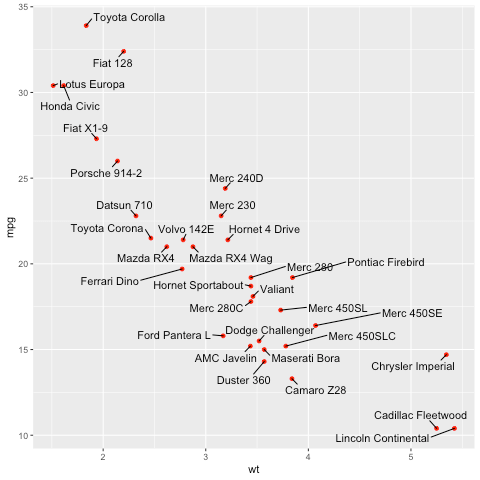
上面這張圖雖然文字沒有重疊,但是由於資料點太密集了,所以有些地方會不太容易看清楚哪一個點對應那一行文字,這時候可以將文字的間距拉開一點,並加上所有標註的連線,這樣會讓資料標注更清楚。
# 加上所有標註連線
ggplot(mtcars, aes(wt, mpg, label = rownames(mtcars))) +
  geom_point(color = 'red') +
  geom_text_repel(min.segment.length = 0, box.padding = 0.5)
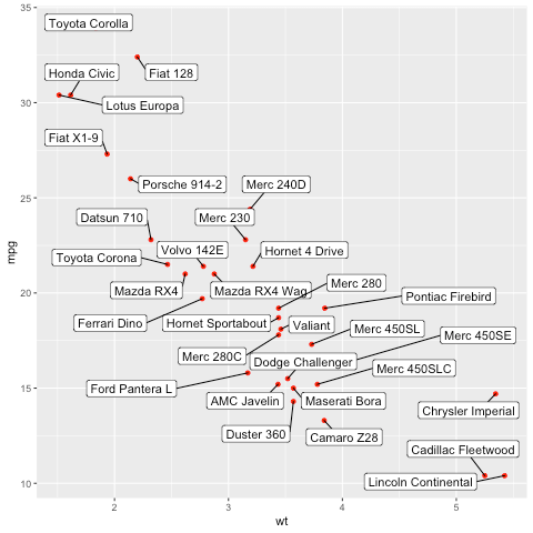
除了 geom_text_repel 之外,還有另外一種 geom_label_repel 標注圖層,它會以有方框的文字來標示資料:
# 方框文字標示
ggplot(mtcars, aes(wt, mpg, label = rownames(mtcars))) +
  geom_point(color = 'red') +
  geom_label_repel(min.segment.length = 0, box.padding = 0.5)
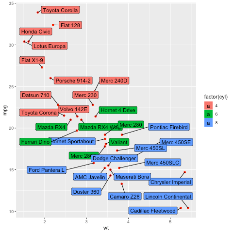
geom_label_repel 的方框也可以根據資料上色,表現分組的資訊:
# 以文字方框顏色區隔群組資訊
ggplot(mtcars, aes(wt, mpg, label = rownames(mtcars))) +
  geom_point(color = 'red') +
  geom_label_repel(aes(fill = factor(cyl)), min.segment.length = 0, box.padding = 0.5)
ggrepel 預設會自動將文字放置在適當的位置,而我們也可以自訂一些排版條件,讓文字依照自動的規則對齊,讓圖形看起來更整齊:
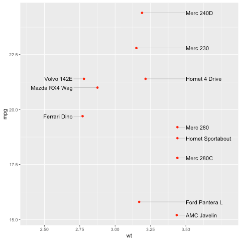
# 對齊標示文字
dat <- subset(mtcars, wt > 2.75 & wt < 3.45)
dat$car <- rownames(dat)
ggplot(dat, aes(wt, mpg, label = car)) +
  geom_text_repel(
    data          = subset(dat, wt > 3),
    nudge_x       = 3.5 - subset(dat, wt > 3)$wt,
    segment.size  = 0.2,
    segment.color = "grey50",
    direction     = "y",
    hjust         = 0
  ) +
  geom_text_repel(
    data          = subset(dat, wt < 3),
    nudge_x       = 2.7 - subset(dat, wt < 3)$wt,
    segment.size  = 0.2,
    segment.color = "grey50",
    direction     = "y",
    hjust         = 1
  ) +
  scale_x_continuous(
    breaks = c(2.5, 2.75, 3, 3.25, 3.5),
    limits = c(2.4, 3.8)
  ) +
  geom_point(color = "red")
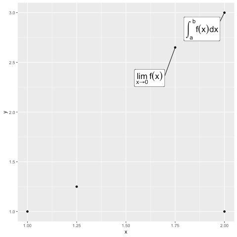
ggrepel 也可以將數學公式或符號直接標是在圖形中:
# 標示數學公式
d <- data.frame(
  x    = c(1, 2, 2, 1.75, 1.25),
  y    = c(1, 3, 1, 2.65, 1.25),
  math = c(
    NA,
    "integral(f(x) * dx, a, b)",
    NA,
    "lim(f(x), x %->% 0)",
    NA
  )
)
ggplot(d, aes(x, y, label = math)) +
  geom_point() +
  geom_label_repel(
    parse       = TRUE, # Parse mathematical expressions.
    size        = 6,
    box.padding = 2
  )
關於 ggrepel 的更多使用方式,可以參考 ggrepel 的官方網站。